We’ve been working on some small, incremental changes to improve the Race Dashboard. Here’s what’s new!
Before: 
After:
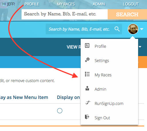
1. Introducing the Avatar Menu!
It has a picture of you (yay!), and has all of your useful things in it:
2. Top Menu moved into Avatar Menu.
The Top Menu doesn’t need to be out at all times. We’ve put that into our nice new avatar menu. Is it an extra click? Yes. But it gets clutter off the screen and allows for a much cleaner header layout. This style of menu is common across many web applications, like LinkedIn and Google. Users are accustomed to looking for global types in a menu like this. Think about it this way: I use my fork every day to eat breakfast and dinner. Do I leave it out on the kitchen table? No, I put in away in a drawer when I’m not using it. (After I wash it – I promise.)
2. Logo
We’ve made it smaller, so we can further shrink the header and get back some vertical space. We also converted our logo into a super-crisp icon font, which looks sharp at all sizes, and downloads faster than an image logo.
3. No more Menu Label
I know it’s a menu and you know it’s a menu. So do we really need to put a label on it? No.
4. We put the Gear away
This is how you get to your dashboard settings, which is something you don’t do every day. Prime candidate to be put away into our Avatar Menu.
5. Moved the Menu Icon
Also known as a ‘hamburger’, this icon toggles the visibility of the menu. We can’t really keep it here, now that we’ve removed the Menu label and Gear icon, so we’ll bump it up into our nice clean header. The header is also a common place to have a menu toggle button. Users are familiar with finding it there.
6. New, Consistent Search Components
We have two search elements on this screen: People Search, at the top, and Menu Search, in the menu. To be consistent, they now use an identical search element, with a slightly different color theme.
7. Our new font continues to propagate
You may have noticed some font changes over the past few weeks, most noticeably on the menu. We have decided to retire our old font, Sanchez, in favor of a new font, Roboto. The Race Title is now in Roboto, which will be our new font moving forward. Roboto is a more modern, sans-serif font, and has some humanist characteristics that we love. It’s great to read on screens and fits better with the RunSignUp brand. You will continue to see less Sanchez over the next few months and more Roboto!
8. Menu Color Changes
We adjusted the menu colors to make them brighter and to properly weight the sub nav menu. We also eliminated some unnecessary elements like borders between the top level nav items. Our new font, Roboto, with its lack of serifs, helps the menu to appear cleaner.
9. Header background image replaced with Gradient
We retired our background image of the runners. It was time. In doing to so, we introduced a new gradient background, which adds vibrant colors, to modernize and brighten things up.
More updates are on their way! Let us know what you think.


Nice improvements.
I may sound like a heretic but please make it easy for us to replace the orange and blue theme with a custom standard theme that we can load for each race. My biggest complaint is that the race pages are not as crisp and clear as I would like due to blue and orange fonts etc.
Hey Greg! You can customize the colors on each of your race pages (https://runsignup.com/How-To/Customize-Race-Theme). Are you looking for the ability to copy a custom theme from one of your races to the others? If that’s not a correct understanding of your comment, let us know so we can log the suggestion correctly.