
Hi All!
As a Spring Cleaning exercise, we’ve updated our Race Dashboard with a clean, modern visual update:

Everything in the left navigation is the same as before, it just has an updated style. Likewise, everything in the Race Title Tile is still there, just moved around a bit.
We will be making minor adjustments to this style over the next few weeks.
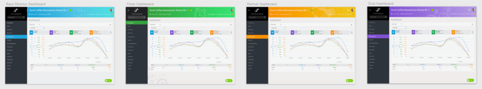
Over the next few months, we will be rolling out the new dashboard style to our other dashboards as well. Each dashboard will have a distinct color, so it will be clear when your switch dashboards. Here are what all the dashboards will look like, side by side:
Let us know what you think! ux@runsignup.com
I have been with RunSignUp since y’all started and I really like most everything that y’all have done. There is one thing that I would like to see different. It is the font color for most of the info on the dashboard pages. The light baby blue color is difficult to see for those of us with poor sight as it is so light. Also it doesn’t print out well and I like to print out many details for my clients to keep track of some things for them. If it could be a dark blue that would be so much better.
Hi Bertha, Thanks for the feedback! We will take a look at your suggestions for the next update.